Best Page Color While Designing in Figma: A Guide to Choosing the Perfect Palette
A curated collection of essential reads for UI designers at every level
5 mins reading
Choosing the appropriate color palette for Figma design goes beyond simple aesthetic choice; it's a basic element influencing user experience, brand identification, and even accessibility. Among the most often asked questions by designers is, "What is the best page color while designing in Figma?" Keeping in mind usability, visual appeal, and usefulness, this article will investigate how to choose the appropriate colors for your designs.
Why Should Page Color Count?
A fundamental component of design, page color determines the tone and atmosphere of the whole project. Whether you are creating a dashboard, mobile app, or website, the colors you pick will affect user interaction with your offering. A correctly selected color scheme may guarantee a flawless experience, guide user attention, and arouse particular feelings.

The choice of page color is crucial in Figma, a tool renowned for its adaptability and collaborative aspects since it sets the basis for the whole appearance and feel of the design. Page color affects these things:
User Experience (UX): Page color is quite important in producing simple and pleasurable user experiences. Some colors are well established to improve user perception of your design, lower eye strain, and increase readability.
Brand Consistency: Colour is really strongly related to brand identification. Using consistent brand colors all across your design will help to increase brand loyalty and recognition.
Accessibility: Page colors should be selected such that every user, including those with visual disabilities, can access them. Important factors are high contrast and color-blind friendly pairings.
So, what’s the best page color while designing in Figma? Let’s explore the factors that will help you decide.
Factors to Consider When Choosing the Best Page Color

1. Design's intended function
The first factor to consider when choosing the best page color while designing in Figma is the purpose of your design. Are you creating a website for an eco-friendly brand, or perhaps an e-commerce platform for luxury goods? Different design purposes call for different color approaches:
-
Neutral Colors: Shades like white, light gray, and beige are commonly used for business, tech, or professional websites because they evoke simplicity and professionalism.
-
Vibrant Colors: Bright, bold colors such as red, yellow, and blue can work well for creative portfolios, fashion brands, or youth-oriented apps, as they attract attention and create a sense of energy.
-
Dark Colors: Dark backgrounds, such as black or navy blue, are often used for luxury brands or entertainment platforms, as they evoke elegance and sophistication.
2. Psychology of Color

The psychological impact of color is another critical factor to consider. Each color evokes specific emotions and associations. Understanding the psychology of color can help you create designs that elicit the desired emotional response from users.
- Blue: Known for its calming and trustworthy qualities, blue is a great choice for websites related to finance, health, and education.
- Green: Associated with nature and health, green is a popular choice for eco-friendly brands, health apps, and outdoor adventure sites.
- Red: Often linked to excitement, urgency, and passion, red can be used strategically for call-to-action buttons or sales promotions.
- Yellow: Bright and optimistic, yellow can convey happiness and energy, making it ideal for entertainment or kids' websites.
3. Readability and Contrast
Readability is among the most critical components of a user-friendly design. High-contrast color selections guarantee clear and understandable visibility of text and other design components. Experimenting with various backdrop colors and typefaces in Figma can help you to find the ideal balance.
- Light Background, Dark Text: This is the most common and accessible combination. A white or light-gray background with black or dark-gray text provides excellent readability.
- Dark Background, Light Text: If you’re going for a dark-themed design, make sure the text is bright enough to stand out. High contrast between text and background is crucial for accessibility.
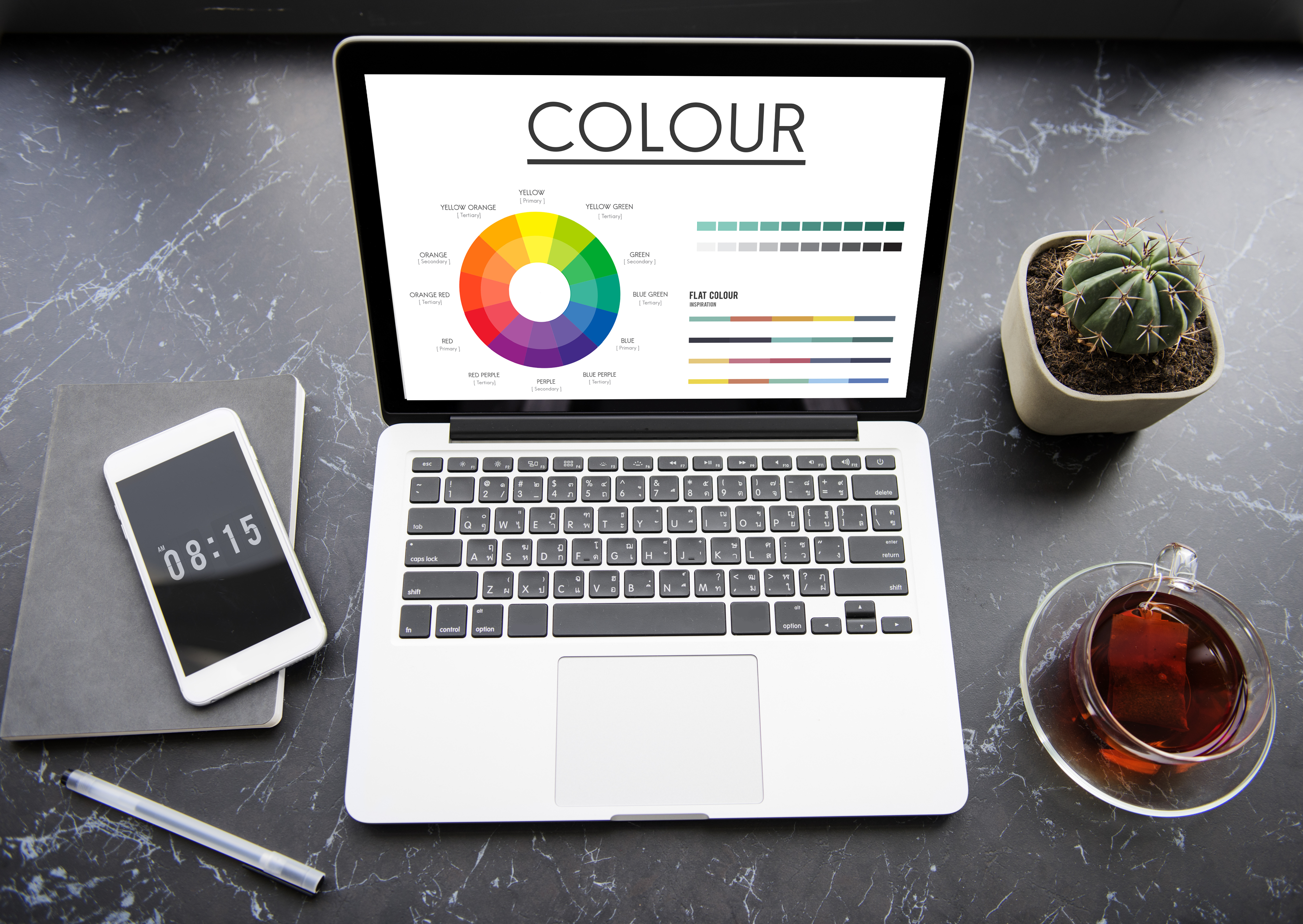
- Complementary Colors: Pairing colors from opposite ends of the color wheel can create a striking and visually appealing contrast. Just be mindful not to overwhelm users with too many contrasting elements.
4. Aesthetics and Trends
Keeping up with design trends can help you create modern and visually appealing designs. In 2024, the following color trends are gaining popularity:
- Muted Earth Tones: Colors like terracotta, olive green, and muted blues are popular for creating warm, natural, and organic designs.
- Neon Accents: Bright, neon colors are making a comeback, especially as accent colors in minimalist designs. They can add a pop of energy without overwhelming the user.
- Gradients and Duotones: Blending two or more colors in a gradient or duotone effect can give your design depth and visual interest. While it’s great to be aware of trends, always remember that the best page color while designing in Figma should reflect the project’s core goals and target audience.

Conclusion: The Best Page Color While Designing in Figma Selecting the best page color while designing in Figma is not a one-size-fits-all solution. The right choice depends on a variety of factors, including the purpose of the design, the psychology of color, readability, and current design trends. By considering these elements and using Figma’s powerful design tools, you can create visually appealing and functional designs that resonate with users. Remember, the best page color is one that enhances the user experience, aligns with your project’s goals, and remains accessible to all users. Whether you choose a neutral palette, vibrant hues, or a trendy gradient, your design should always prioritize clarity, consistency, and usability.
Nucleus UI
Admin at Nucleus UI